Mr. and Mrs. Muffins summer project!

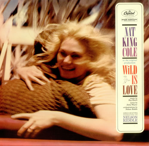
After deciding to take a break from school this quarter, I spend most of my times focusing on some personal projects. One of them is preparing to release Mr. and Mrs. Muffins second album, just like the first album we are thinking to release it on vinyl again. But this time, we are aiming for a more ambitious look with a gatefold cover and illustrated booklet attached on it. We like the experience that we got from gatefold vinyls with album booklet attachment that you can find in most vintage children’s music vinyls and one of Noah and my favorite album “Wild is Love” by Nat King Cole.

Nat-King-Cole-Wild-Is-Love-456045

The songs on this second album still has the nostalgic and storytelling vibe. Mr. Muffins thinks that this album sounds more sad than the first one, but I think  it sounds more hopeful. Perhaps we can blame the pregnancy mood for that feeling. I’ve been thinking a lot about De Stijl and Swiss Design. I used simple shapes, solid colors and playing with negative space to form  little creatures in each pages. The second step of the illustration process, would be to add some textures that hopefully still maintain the nostalgic sound of Mr. and Mrs. Muffins. These are some of the works I’ve done for this project;

cover

2a 3 4 5 6 backcover-06

This is a short video of one of the song that will be on The Misty Cowboys and Other Songs to Dream By.
SHAPESHIFTER (Final Design)

The last process of creating an app, is the most fun of all, now we get to design it!!.

FINAL TASK : CHOOSE 1 from 3 taskflows for final skin.

We chose a taskflow where we take user to start a strength exercise that are already designed for him, in the process he would add an exercise you his exercise list. Ladies and Gents, we present to you SHAPESHIFTER.

UI

01. HOMEPAGE

ui3

02. EXERCISE HOME: in this page user will be greeted with his goal, progress and log for exercise.

ui4

03. STRENGTH: Coming into strength page, user will see list of exercises that either already designed for them (Shapeshifter Route) or repopulate based on popularity (Personal Route). They will be able to see video of exercises to see a correct form in exercising. They will also able to adjust the intensity of their exercise (changing rep and weight).

ui6

04. ADD/EDIT SHAPESHIFTER WORKOUT : in this pop up page, user can add a new workout to the list by simply clicking on any muscle parts of the blue man and it will delivered them list of workout based on that chosen muscle group. When user’s finished editing their updated workout list, they can click the save button and it will bring them back to STRENGTH page so they can start working out.

PRESENTATION-FINAL-12

05. MOTIVATIONAL POP UP: user will see this pop up page everytime they are finished with their workout.

PRESENTATION-FINAL-17

Shapeshifter – Ipad Fitness Apps

Alright here come our big project for UI/UX class. This was a group project, with Riva Davis and Megan Harris, we worked together for 7 weeks to build a new fitness apps for ipad.

WEEK 1

Task: Research.

This part of the process can be exciting but yet overwhelming at the same time. This is an infographic I made for our research presentation.

UI1

WEEK 2

Task: Use your research and create 3 user persona for your apps

This part is pretty fun cause we got to create a character and their story to imagine the type of user for our apps.

UI2

WEEK 3

Task: Create taskflow for each persona and a sitemap for your apps

Creating sitemap is like playing with puzzle, but then again the designer have to get rid of their subjective mind and think that we’re not the USERS. A card sorting system of asking people who are user target is a good way to map out the site.

We decided to give personal and professional approach on using our fitness apps SHAPESHIFTER. For user who’d like to have a designed diet and workout they can take the shapeshifter route when they’re signing up for a new account.

To save up some space, the highlighted line is the taskflow that each user took on our apps.

PRESENTATION-FINAL-4

WEEK 4

Task: Create 2 wireframe for each taskflow

Okay so in this process, we kinda got carried away and created more than what was expected. I guess it is hard to just focus on several parts while the other part of your apps are screaming for questions and more explorations.

HOMEPAGE : Overview of diet, exercise and social feed of user account

home

PROGRESS: check out and update progress in strength, bodyfat and heart rate

PROGRESS+UPDATE

FOOD: diet log and cheking out nutritional breakdown of food user had or planned to have

Wireframe_FoodHome

EXERCISE : Strength (overview of workout video, and logging exercise)

WORKOUT

EXERCISE: CARDIO (logging cardio workout, synching it with user’s iphone while working out, your ipad can also be used as a live gps of your location and performance data of when your exercising outdoor)

CARDIO IPHONE2

Skinning wireframe-Petpal

UI/UX is one of the most challenging and exciting class last quarter. It is completely beyond designing in aesthetic approach. User is the KING, every single parts of design and interface has to be based on user needs and behavior. Before we headed to our big project for the quarter, we were introduced to the steps of UI/UX work process, one of them was skinning wireframe.

In this training project, we were assigned to design over a wireframe of a photo sharing apps for ipad. I decided to make it into a pet adoption photo sharing apps. The cutest dog on the drop screen is my dog, MAMITA…but she’s not for adoption people!!

Gallery_app

Magnolia Summer Fest!

Practically this was the last print assignment this quarter. The assignment was to create a poster from a chosen event. Out of 4 events I chose Magnolia Summerfest and Art Show, who apparently the least popular event for the whole year (only 3 students chose that event). Magnolia is a family neighborhood and the event that is held annually is everything about kids and family summer fest. My idea is to capture the fun of summer and the main visitors of the event. I know it’s not summer yet, but the beginning of winter break does make me feel like bouncing on watermelon 🙂 Happy Holiday people!

SOFIARIANTIKA_WILSON_POSTER

Grid Layout 101

Final assignment for Monday Graphic Production class!! We were provided with text and 4 images of 3 choices of article. The objective of the assignment was to create 3 layouts with each different style; formal, youth and high impact. Rules: No color other than, Black, White, Shades of Gray!

Like all other projects, we started with sketches and this time we got an aid “THE GRID”. Apparently, designing with grid wasn’t as easy as i thought it would be.

For Formal Layout, a classic look with balance and stability is the approach that I used.

GRID1


For Youth Layout, i dedicated the design for kids 12 years and over. I used more graphical elements and blow a sentence about discovering skeleton in the cave, to make it more interesting for young reader.

GRID-3  GRID2


For High Impact Layout, I was inspired by geometrical shape of cave itself. I wanted to show a clean and modern look. Maybe it suits for some nature theme lifestyle magazine?

GRID3 GRRID4

FUTURA poster

Second Graphic Design History poster assignment, this time I am lucky enough to design a poster for one of my favorite fonts, FUTURA!

Finding out story behind the creation and the long inspiring life of this over 80 years old font is very fascinating!

FUTURA-PRINT

Veggie Apparel Logo Assignment

Hey winter break just started today officially, and I’m starting it by updating this blogfolio.

So on our Graphic Design 1 class, we were assigned to design a logo for a business, there were 3 brands to choose (Elephant Lounge, Veggie Apparel, Green Car). I chose Veggie Apparel! We started by thinking about who are the audience of this brand. I wanted to create something that’s kiddy and eco-friendly, my target audience are mom who are concerned about apparel products for their kids. So here are two of my main sketches :

Untitled-1

From the sketch we rendered it to computer!

TOGETHER

ooo wait this project is not over!! shrink your logo to 1 inch (width or length) so it still look readable in small scale.

and last…once I was done with my final logo, then I designed a set of icons for washing, drying and ironing that have the same look and feel with the logo…..

…MONDAIRY! (Stylizing Blue Whale and Baked Ziti Recipe)

as the quarter getting closer to the ending, more projects are piling…(bad rhyming)

Anyway here are more projects that I did for our graphic production class on Monday :

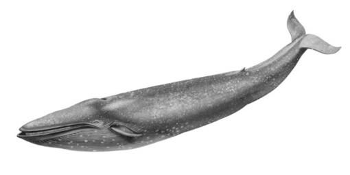
1. STYLIZED OBJECT

Photo source:

BLUE WHALE PICTURE

stylized blue whale:

SOFIARIANTIKA_WILSON_GRAPHIC-PRODUCTION_2014

2. RECIPE

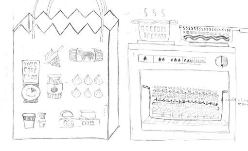
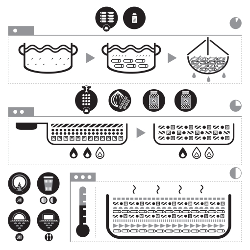
This is an interesting assignment, the challenge was to create a graphical interpretation of a recipe (choose from 3) without using LETTER or NUMBERS. I like stacking shapes like legos so I chose Baked Ziti because the part where I got to layer the “ingredients” was so much fun to do.

recipe sketch 3 RECIPE-1

an alternative look of the recipe

RECIPE2

Nuremberg Chronicle (History Class Poster)

_MG_9272

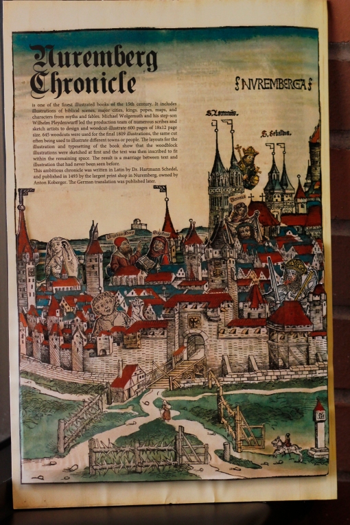
From the earliest form of writing to Gutenberg historical “machine” and his tragic life and the stories behind the creation of everlasting fonts like Caslon, Trajan, Baskerville, Didot and many more tales of what become graphic design, Thursday is a perfect day for history!As our first history project, we were assigned to create an informative poster of an assigned history subject. In my case I got an object, it is a book called Nuremberg Chronicle. This book is not an ordinary book! imagine the time when people still print with woodblock and movable type, somewhere in a busy street of Nuremberg Germany. It’s a huge book, the size of the page is the same with oversize tabloid (12×18 inches) with 600 page, 1800 illustrations and unconventional stories of biblical and non biblical paraphrase of what happened in the world since it was created to 1409 (when it was published) to the prediction of the judgement day.
_MG_9269
The illustrations of this book is what makes it a special book during Incunabula era. Heavy, bold and detail 600 woodcut illustrations were repeatedly used for several parts of the book. Looking through the .pdf of their Latin version book, somehow made me think of my favorite childhood toy, the paper dolls. It was pretty cheap (compare to Barbie) so I could afford having decent collection of them. After deciding to use the city illustrations for the poster, those childhood memories forced me to incorporate some interesting characters I found on the book into the “city of Nuremberg”.

Cat is cute